HBO is currently my favorite streaming platform of choice. It competes with Youtube for when I’m ready to settle down at night and unwind. The utility of streaming platforms has made it so easy to watch almost anything you want. I use the word almost because the more accessible we are to things, we find out we actually want more and more options to fill our needs. With the multitude if movies, tv shows, and series already offered how can a streaming platform make this aesthetically pleasing, but most importantly easy for the user to use.
Let’s take a look at this product: HBO Max on the iPad. Focusing on the usability of their app, I’ll be mentioning usability heaurisitcs to examine how user friendly the HBO app is. Usability heuristics are broad rules of thumb used to analyze the usability of a product and then seeing what can be worked on to improve the product. This is usually done by usability experts who reach a consensus on features that need to be updated using a scale from 0–4. You can create your own heuristics but a great starting point are Jakob Nielsen’s 10 Usability Heuristics.
I’ll be breaking down this review on 4 themes:
Learnability
Efficiency
Memorability
Errors
Satisfaction
Learnability

The interface of the app is my favorite out of major streaming platforms. Due to its minimalist design approach this allows for clarity in what you can do anywhere you are throughout the app. This page featured above, is when you’ve chosen a genre to start your movie search. This is accessed from the vertical left menu bar which is easy to access because it is the global navigation that is on every screen. Featured at the top are the different options on the horizontal bar. The dense purple line marks which navigation you are at and is easy to learn because it is the brand color which is also used for other major buttons such as the play button. Even though you are not on the alhpabetical A-Z tab it is easy to still access on the right hand side if you still do want to search alphabetically. This sort of documentaion shows the user all of their options, so they don’t even have to go back to a particular tab combining several interactions in one place.

The consistency within the UI is handled very well. The black and purple gradient in the back is suprisingly not overwhleming for all of the different movie thumbnails that they are promoting. Without having clear CTA buttons to click on each movie thumbnail, which would look very cluttered, you know you can click on a thumbnail and it will take you to where you want to be. The hierarchy within the screen make it easy to learn the interface. Either you can search movies which grab your attention immediately or you can be more specific with the horizontal menu bar.
Efficiency

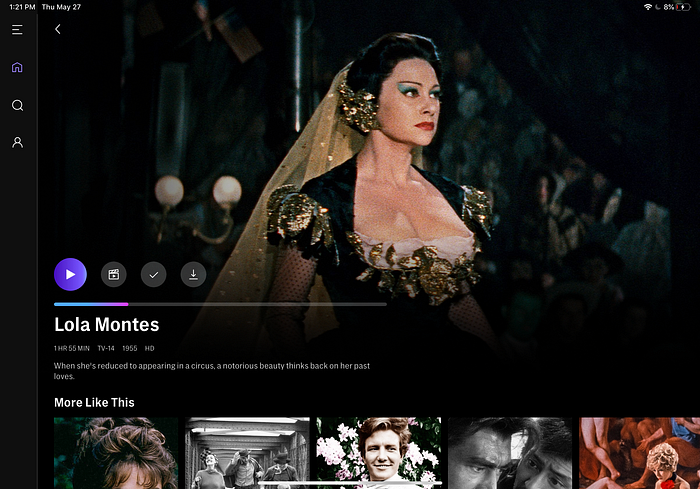
Whenever you go back to a movie that you previously started, it features the progress bar for how much you’ve watched. I personally think the purple blue gradient is a nice touch for visibility of how far along you are in the movie. One recommendation I have, is for the thumbnail displayed, to be the last scene that you left off at. This would help with efficiency in making a decision faster remembering the last scene you watched and if you want to continue the movie or check out something else.

The slide out menu from the left side provides flexibility for the user to determine whether they want to keep scrolling on the page or fall into the depths of just searching for a movie the whole night instead of actually watching one. A clear exit sign for the menu is located on the top left corner, but since this is on an iPad you can simply tap on the right side to bring you back to the page you were looking at.
Memorability

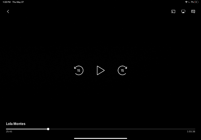
These buttons are so classic! The play and rewind button modernized with a thin lightwieight line to make it modern. This is useful for both the experienced and newbie user trying to figure out what the buttons mean based on their memory of classic VCR remote buttons. Sticking to the basics for icons is truly the best for efficiency and the user. Imagine trying to recreate the play or rewind button, no one would know what they mean and would contribute to a huge learning curve just for basic functions of the app.

The heuristic called match between the system and real world made me realize that the creation of movie posters or dvd covers will never die out in the industry. It’s like when you go into the DVD store and see all the titles, this is the same feature going on here. Of course having this as an interface is a cleaner version of DVD’s displayed, versus someone working in the DVD store needing to go along the isles making sure each DVD is evenly spaced.
Errors

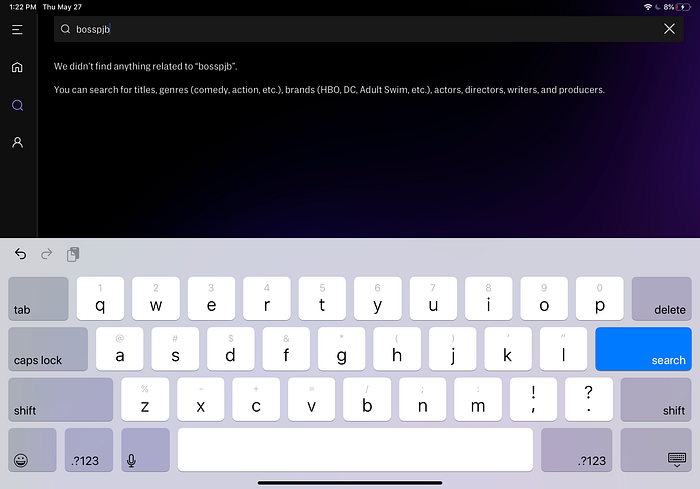
Suprisingly for the error prevention of typing in this nonsense word did not lead to any high contrast color that popped up. It has a simple 2 sentences that are friendly to the user in language as well as search suggestion topics. I don’t believe these two sentences are that accessible as the font is quite small. I’m not sure if this would be considered a dark UX pattern if they decided just to promote suggested movies based on the nonsense word. Another option the app can do is suggest genres to then search by with a horizonatal scrool showing the user their options without pointing them in one direction.

The search that I did with the word “boss” actually resluted in a lack of movie listings that showed up with the actual word. Only 1 out of 9 show a movie with the word boss in it and all the others feature “boy”. I think for better help and documentation of the search there could be a seperate section dividing actual movies featuring the term, then HBO’s reccommendations so that their is less frustration for the user to then think they have to type in something more specific. This may be due to incorrect tagging in the movies meta descriptions as well.
Satisfaction

This is a new feature I found in which you can edit what movies show up on your continue watching list. Sometimes other people in my household will accidentally use my profile, leading to movies that I have no interest in popping up in this section. By the way this is important because for the hierarchy of the homepage “continue watching” section is the first row you see after the hero image. There is freedom for me (the user) to control what gets shown in that first row. Once the edit button is clicked I have the freedom to get rid of movies which leads to saving time and efficiently choosing something to watch where I left off.

I appreciate that while scrolling on the homepage there are many different categories to search through. The whole app is aesthetic and minimlalist in design. Each row can be varied in how they show movies and not just have horizontal movie thumbnails that go on forever. HBO tries to vary the interface for instance using this low opacity of their logo and clear CTA button for some breathing room between sections. This helps with trying to find new movies with each clearly defined themed row. Even though each row may alternate in different UI design it is still approachable and not overwhelming. I’m more likely to explore HBO’s productions because of this since they’re not shoving it in your face to watch only their productions from the get go. I used to have fun watching all the indie or old cinema that I can find on Netflix, but then they started producing all their own entertainment so it got hard to find anything else even when using their search bar.
Thankfully HBO does not have any dark patterns atleast to my awareness. I know I go to it when I really want to watch a movie or find something unique to watch and it always delivers. I haven’t found myself addicted to watching things unless it really is a great show that I want to binge watch. I would say the loading times do take longer than usual for the interface, due to loading all of the thumbnails due to their larger size. HBO does a great job of balancing the types of movies they promote, their own media, and movies based on what you’ve been watching.
